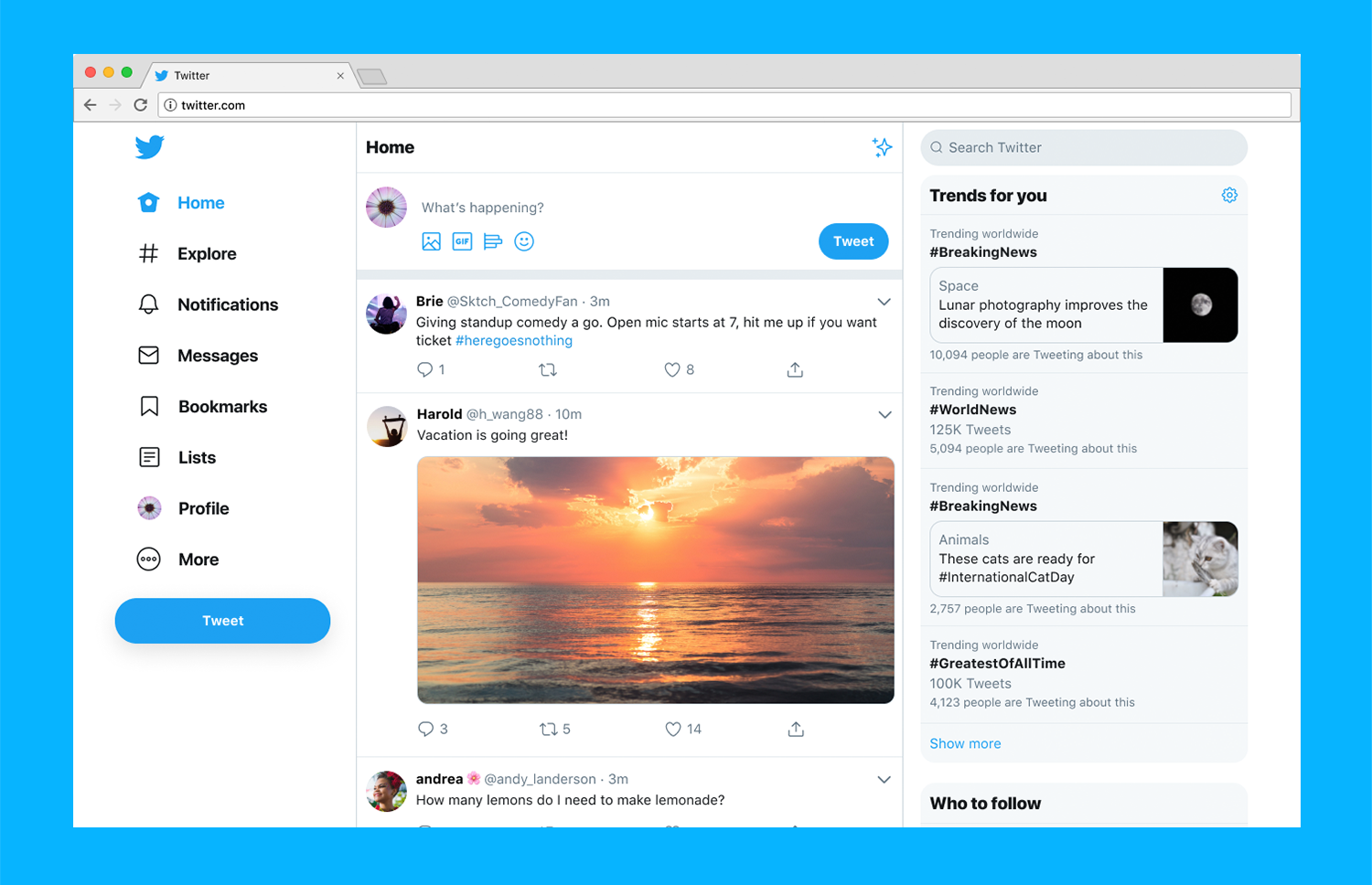
A major overhaul is being introduced to one of the very popular social media platform –Twitter. Since the beginning of the year, the company has been testing a new variation to be introduced to the desktop version of Twitter. And, finally, the new changes made to the social media platform are being rolled out in the public.
With the newest version, the navigation of the website will become simpler as a fairly large left side window is being introduced that will contain all the key features including –Direct Messages, Notifications, Bookmarks, Explore, Lists, and more. The feature expands further by introducing a more inbox-like feature where you will be able to read the messages and respond to the conversations in one place itself. Switching of profiles now became easier on Twitter, with the introduction of advanced themes, search, and many more astounding features.
You can now personalize Twitter with various themes which include the very famous –dark modes, very black Lights out mode, and Dim lighting mode. Also, there are various color options available too. However, the most noticeable change that the users might experience is done on the Home screen of the Twitter website.

